I know that progress is a good thing. Progress is defined by Merriam-Webster as “gradual betterment,” which is kind of a crappy phrase but it gets the meaning across nonetheless. So I like progress. Who doesn’t, right? Everyone likes it when things get “better.” Yay! As we say here in Boston (and we’ve said it a lot in the last few years) “Queue the duck boats, let’s have a pahty.”
But, just so we’re all clear: progress is not the same thing as change.
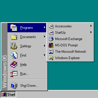
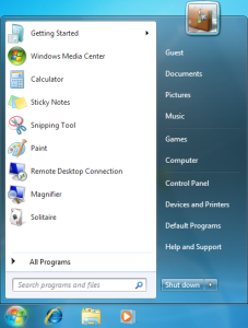
By now, I should probably tell you WTF I’m talking about. OK, I’m talking about Windows 10. And lots of other application interfaces, like the ones on the iPad’s WSJ app and the Weather Channel apps. But I really want to concentrate on talking about Windows 10. And, yes, I’m going to talk about the start menu. And in order to do that, I have to talk about Windows 8. And Windows 7. And Windows 95, which is where I’ll start. Ha. Where I’ll “start.” Kinda like a joke.


Then along came Windows 8/8.1 and as we all know, the start menu disappeared. Instead, we got a start screen, which just about everyone will tell you is evil. “I can’t use it”, “I can’t find anything”, “It sucks”, “I want Windows 7 back”, “I hate Windows 8 because of the start screen”… you’ve heard all this, I’m sure. Heck, some of you probably say it. It’s Internet wisdom, and thus, of course, it is true and not to be challenged.
The biggest complaint I hear from the “haters of the start screen” is that their stuff can’t be located by category anymore like you could on the Windows 7 start menu.
Well, I certainly agree that the ability to find your apps by category is vital. When I want to find “the command prompt thing for VS that has the ARM Phone tools” I should be able to look under “Visual Studio 2012” or “Windows Phone” something to find it.
Can’t find it on Widows 8.1, can you! Nope! Because the start menu is gone. The bastards!
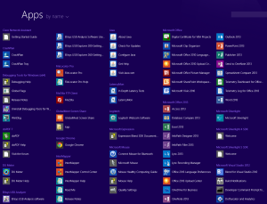
Well… on Windows 8.1, you go to the start screen (click the start screen button), then click the down arrow on the start screen. Voila! List of desktop apps, sorted by category. And since you have the whole screen, you can see all the apps under a given category. No more Windows 95 and Windows 7 style hiding stuff in “folders” that you have to open. Yay!

Nope, ignore that. The Internet says the Windows 8.1 start menu sucks, so that’s all most people need to know about it.
So, as you can see, I am definitely not one of the start screen haters. Well, let’s be clear. I hate the Modern start screen, of course… but once you click the little down arrow and get the display you see in Figure 3, I’m loving it. Given that I sit at my system 60 or so hours a week, the fact that I can get work done with a minimum of annoyance is a good thing.
Therefore, regardless of what the Internet says, I would consider the Windows 8.1 start screen “progress” – or at least, not a step back in time.
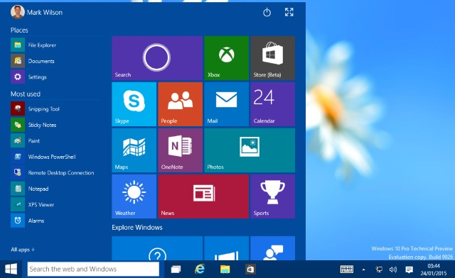
But given that the Internet has been clamoring for the return of the start menu, and Microsoft’s Team Nadella wants to appear receptive (perhaps even downright responsive!) to customer requests, the start menu is returning in Windows 10. Bye bye start screen. The result from (publically released) Build 9926 is shown in Figure 3.
Click on the start button, you get a little mini start screen. Then you click on “All apps”, and what do you get? A kind of weird agglomeration of tiles, Modern app names, and folder names sorted in alphabetical order. So under “W” for instance, you see an icon for the “Weather” app, and a little folder icon that says “Windows Accessories” (click to open), oh… there’s where Notepad is hiding. Hello Notepad!
So, the way things look today, on Windows 10 you get your itty-bitty, Windows 95 and Windows 7 style, list of folders back. And while you can increase the size of the start menu to full screen, the useful Windows 8.1 style category view for desktop apps is nowhere to be found.

There’s a saying in English “The customer is always right” – In French they say the analogous “le client n’a jamais tor.” I say this is complete bullshit. In tech, the customer is almost never right. Because the customer almost always wants exactly what they’re used to, what they’ve had for years, until they try, seriously try, the new thing you’re giving them. And when it comes to user interfaces “change aversion” is legendary. The problem is with the Internet echo-chamber, it’s easier to just repeat the latest meme than spend the time to think through an issue.
So, the Windows 95 / Windows 7 start menu is definitely not superior to the Windows 8.1 start screen. Not by any rational standard I can think of. And returning to a 20 year old design in Windows 10 does not seem like a good way to make progress to me.
But, I think the real question is why does it have to be one way or the other? I think the only mistake Microsoft made in Windows 8 was forcing the start screen on people, and not providing the older start menu interface as an option during the transition period. Make it so people can use the old way that they’ve come to know and love, while they have the opportunity to eventually try out the newer interface. If they had done this, I bet the reaction to the changes in Windows 8 wouldn’t have been even half as vehement.
And so, for Windows 10… if you have to give us the little bitty strip of application folders, can we at least also have access to the Windows 8.1 start screen somehow? Maybe when you enlarge the Win 10 start menu to full screen, it becomes the older Windows 8 apps start screen, the one you see when you select the down arrow?
Well, there’s plenty of time for the look and feel of Windows 10 to change. No date has yet been announced for its release. And in the time that’s left, I hope Team Nadella gives the rabble the start menu they want today, and the start screen they’ll come to appreciate if they ever freaking try it.
If they don’t give us a start screen, maybe we can raise a fuss on the Internet. Wouldn’t that be funny. People clamoring for the return of the Windows 8.1 start screen.
Nah. It won’t be an Internet meme. Never happen.
Peter Pontificates is a regular column by OSR Consulting Partner, Peter Viscarola. Peter doesn’t care if you agree or disagree with him, but there’s always the chance that your comments or rebuttal could find its way into a future issue. Send your own comments, rants or distortions of fact to: PeterPont@osr.com.
